![]()
Capo 4.6, reworked for macOS Tahoe
• Chris Liscio
![]()
• Chris Liscio
Boy howdy was this a busy summer for me, and I am really excited about today's update.
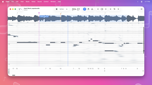
On the surface, the list of tent-pole features in this release is short: I moved the controls into the toolbar, and gave Capo a new icon. whoop-dee-doo!
But if you're a long-time user of Capo on the Mac who struggled to navigate the Control Strip, and I know there are lots of you out there, Capo 4.6 will feel like a cup of ice-cold water in the desert. If you're not one of those people, but you appreciate Mac-assed Mac apps, then I have a good feeling that you'll also like this update.1
To me, Capo looks downright sexy in macOS 26:
And you can get your hands on it right now from the App Store.
I wanted to adopt the native toolbar to macOS years ago, but I never really liked how toolbar buttons kept disappearing into the window chrome. Also, it was quite a lot of work to take apart and re-build the project window to pull this off. But now in macOS 26 there is at least a hint of button-y things in the toolbar.2 So it became very clear (ha!) that this Fall update would be a good opportunity for me to travel down this road.
But I think that the biggest benefit of a toolbar is customization, and Capo goes hard (perhaps a little too much) in this sense. In Capo 4.6, each of the song views—Practice, Tabbing (seen above), Structure, and Chords—will maintain separate arrangements of controls in the toolbar. To give an example, there is now a Freezer3 toggle available to add to your toolbar, and you might want it in the Practice and Tabbing views, but you don't tend to use it in the Structure and Chords views.
I really want to start on ${YOUR_PET_FEATURE_REQUEST} ASAP. But after yesterday's discovery, it's now painfully clear that I have to keep working to fix my crumbling marketing machinery. And while this is my least favorite thing to work on—tooting my horn, shouting from the hilltops about why my work is great and deserves your financial support—it is necessary work that will help make ${YOUR_PET_FEATURE_REQUEST} possible.4
I'd like to think that Capo was always Mac-assed, but I have to admit that the Heads-Up Display and Control Strip that were originally designed for (and still live on in) the iOS version had made things awkward for a while. This wasn't as egregious as "choosing a web front-end to easy cross-platform development", but it was certainly a design decision meant to make my life easier maintaining parallel UIs on two platforms. ↩
I also really like the new grouping behaviour. For example, the controls that once occupied the Playback Control Strip—the three buttons to the right of the position display—can be kept together to suit your preferences. You also now see the play button, tempo, and the key indicator grouped together: the latter two revealing the speed and transpose controls in a popover. ↩
This is the "frozen audio" effect you hear when you scrub the playhead on the timeline. You can now use this control to keep the audio frozen while you keep listening and looking for note(s) on your instrument. ↩
And, trust me, I know that whatever feature you have been asking for—possibly for years—has been bugging you. But I can tell you that not only has it been bugging me, but it keeps me up at night thinking about how to make it happen. I want all of these cool things in Capo just as much (if not more) than you do! ↩